Posts Tagged ‘visualization’
10 free tools to help you clean, analyze and visualize data
Freelance journalist Samantha Sunne and Helena Bengtsson, data projects editor for The Guardian, spent an hour at the 2016 CAR Conference going over free, open-source tools that can replace expensive data cleaning, analysis and visualization programs. Here are some of my favorite tools the speakers mentioned: 1. Google Sheets Google Sheets is a widely known…
Read MoreTableau announces Mac version to be released ‘early next year’
At its customer conference this week in Washington, D.C., Tableau Software announced that a Mac-compatible version of its software would become available along with the newest version, Tableau 8.2, to be released most likely “early next year,” according to the Tableau Public blog. Tableau’s public and desktop versions of its data analysis and visualization software…
Read MoreTableau makes its desktop software free to IRE members
** 2018 update: Please read this blog post on additional free Tableau benefits for current IRE members ** Today IRE is announcing a partnership with Tableau Software, maker of Tableau Public, to provide Tableau Desktop free to IRE Members. This should provide tremendous value for IRE members, who can use Tableau Desktop to develop stories…
Read MoreQuick tips on presenting data-driven stories
Cheryl Phillips of The Seattle Times and Anthony DeBarros of Gannett Digital presented on how to fit your data to the appropriate presentation style. Just like when you’re shopping for clothes, you should ask a lot of questions before you buy (or in this case, before you spend resources designing anything). What is the story…
Read MoreBehind the Story: The reality of Oklahoma’s Quality Jobs Program
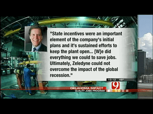
Last month, the Oklahoma Impact Team for KWTV News 9 in Oklahoma City and KOTV News on 6 in Tulsa, Okla., examined the much-touted Oklahoma Quality Jobs Program to see if it works as intended or amounts to a corporate giveaway. They found that three-quarters of a billion dollars in tax rebates have been awarded…
Read MoreHurricane Sandy: How data journalists spread information about the storm
Google Crisis Response created this interactive map showing weather, emergency shelters and power authorities. As the East cost braced for Hurricane Sandy, data journalists across the country were working in realtime to spread the news. We gathered some of the interesting interactive coverage and data visualizations we found from around the web. Have a suggestion…
Read MoreOSHA Workplace Safety data updated at NICAR Data Library
The Workplace Safety database from the Occupational Health and Safety Administration (OSHA) has just been updated in the NICAR Database Library. WHAT’S IN IT? This ten-table database holds information on workplace inspections performed by both federal and state OSHA offices in all states and U.S. territories, from 1972 to Oct 2011 – just under 4…
Read MoreEnter the Philip Meyer contest for a chance to win $500
There are only a couple more weeks until the postmark deadline (Nov. 2) of the Philip Meyer contest and we want to see your work! Three awards are given annually — a first, second and third place — to recognize the best work using techniques that are part of precision journalism, computer-assisted reporting and social…
Read MoreBloomberg reporters find FOIA failures in Obama administration
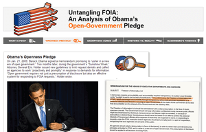
Transparency Watch is an occasional series from IRE tracking the fight for open records. If you have a story about a quest for public records you’d like to share, email us at web@ire.org. By Danielle Ivory, Bloomberg President Barack Obama on his first full day in office ordered federal officials to “usher in a new era of open…
Read MoreVisualizing data with Tableau, a trainer’s perspective
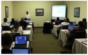
Journalsts at the 2012 CAR Conference attend hands-on Tableau training.Photo courtesy of Tableau By Daniel HomTableau Public Many journalists have experienced leafing through stacks of documents, searching for important numbers to back up stories and trying to relay all of that in a way that captivates readers. It’s a world where too often multimedia…
Read More